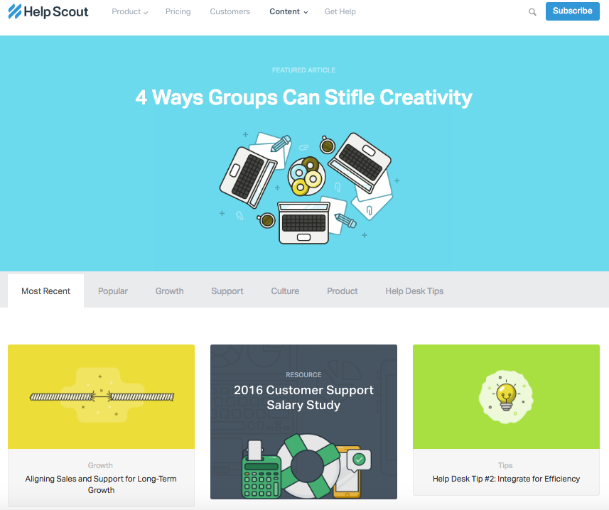
Sometimes, the best blog designs are also the simplest. Help Scout, makers of customer service software, uses a unique but minimalist design on its blog that we love — it limits the use of copy and visuals and embraces negative space.
What we particularly like about this blog is its use of featured images for all posts, including a banner one at the top that highlights a recent or particularly popular entry. These icons are set in front of bright, block colors that catch the readers' eye and signal what the post is about. And it works — everything about this blog's design says "clean" and "readable."
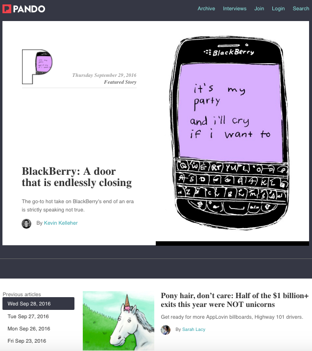
An important aspect of a well-designed blog is a consistent color scheme and style — after all, 80% of consumers say that color boosts their recognition of a brand.
It's interesting to see how color consistency can unify the more diversified elements of design. Pando, a blog that explores the startup cycle, incorporates bluetones in several sections of its site — the background, highlight bars, and certain areas of text. But it also uses several different fonts — all of which manage to look seamless together, when tied together by a cohesive color scheme.
Fubiz, an art and design blog, is an example of a really sleek design that also includes some cool personalization.
Near the top of the blog's homepage, readers can side-scroll through "highlighted" posts. Below that is the Creativity Finder, where visitors can select their chosen personas — from "Art Lover" to "Freelance" — location, and the type of content they're looking for. From there, readers can browse content specifically catered to them.
We can't help but love the header image, too. It uses something called "blue mind" psychology, which has found that the sight of open water can naturally draw us in. By using it in a design scheme, Fubiz is able to visually attract visitors to its content.
I mean, just look at that header image. The bold colors, the wiring overlay, the gripping pupil and the contrasting text. It absolutely catches the reader's eye — no pun intended.
Mashable breaks its content into three noticeable sections on the homepage: New posts are listed on the left in the smallest sized thumbnails."What's Rising" posts are displayed in the center column as large thumbnails, and the "What's Hot" posts are shown to the right, also as large thumbnails. This three-pronged approach to displaying content can help readers decide which kind of news matters to them the most — the attention-grabbing top story, or other posts that are currently trending.
Plus, we like that the number of shares is displayed in each post preview — that's a great form of social proof.
Everything about the Brit + Co homepage says "clean," "warm," and "welcoming." It's free of clutter, making the content more digestible, and the layout is extremely organized.
We dig the seasonality of the site, too. I mean, avocado jack-o'-lanterns on the dawn of October? Adorable, and replete with a colorful, fun photo to illustrate the story's content.
The subtle "trending" header also serves as a nice way to promote popular content, without being too in-you-face about it. Plus, with such great visuals, we took note of the nod to Pinterest — that icon is important to include when your blog incorporates attractive imagery.
Much like Crew, the photography blog, 500px, leads with one featured article and a big, bold, high-definition photo to draw the reader in. That makes is pretty clear what the blog is about — it boasts valuable content on photography with gripping photography.
Plus, how cool is it that the social links are right there, obviously displayed above the fold? They keep readers engaged with the content, and make it easy to share the photography — and, content with images is up to three times as likely to be shared on social media.
Pixelgrade is a design studio that creates stunning WordPress themes for all sorts of creative people and small businesses. Their blog page does a great job of highlighting one of their most recent or popular blog posts, alongside a clear call to action and a short excerpt. What I like best is that the design of the page is 100% in line with their brand and how they communicate on other channels as well, like Instagram, Facebook, or Twitter. You will have no problem in identifying their blog posts, among other content you might come across while scrolling on social media.
Original Source by Hubspot